My approach towards this project was to try and do something different by doing some dramatic, fantastical type imagery.
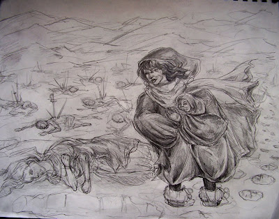
The basic story here is that this particular land has been midst a civil war and the remains of it are slowly being frozen and lost in this wintery realm. Due to the extreme climate and fighting, the population has decreased massively, people are banded together in small, broken groups except for the hunters, due to their survival skills. One such hunter gets lost from the group and falls into the snow to find a young child still alive in the frozen dead arms of it's mother. She takes the child with her and eventually her and her clan grow in number and find an abandoned blade laying in the grass. This blade ends up leading them to an abandoned castle where they begin to settle and the blade becomes a symbol of the newly formed colony.
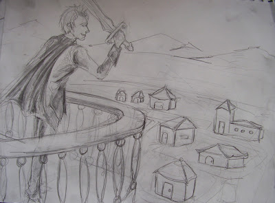
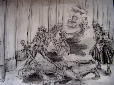
The colony grows and collects scattered members of other races and former classes and eventually decides they need a figurehead for their new land. Being the 'son' of the original group of hunters, the surviving child, now an adult rises to power. Because he was taught to treat the land and the animals he grew up hunting with respect he carries that through in his reign. However, he is much too trusting and a few individuals, descendants of the original inhabitants of the castle begin to plot against him. They eventually strike him in the back with the symbolic blade of the colony and he falls to the ground, however, this time he is no longer a survivor.
I wrote this out in a more descriptive, drawn out way but it kind of bothers me. If anyone wants to read it ask I guess but this is pretty much idea.
So, on to the images. The first one attempts to potray the 'rescuing' of the child. (though like an hour ago I got the grand idea that maybe i should make the first image the discovery of the castle, wish i had thought of that earlier) the second image is him looking upon his kingdom. I was originally going to do a crowd but I had no idea how to pull that off without it looking terrible so any suggestions there would be great. And the third image is the one i'm hating the least right now, the dramatic death of the ruler.


I'm planning on doing these in acrylic on an 14x17 scale. I'm unsure if the peices are enticing and 'epic' enough. The only composition i'm truely happy with is the last one. The other two, especially the middle i feel get kind of boring, and i'm unsure if the 'fantasy' feel is really coming off.
Please, go all out on crit, I need it!!
The first panel: I LOVE the composition on this one. Even though it's simpler, I really like how the woman's clothes look so flowy. You really nailed that.
ReplyDeleteThe second panel: I want the houses to be more rendered, and I think the balcony could use a good rendering as well.
The last panel: Somehow the dead man looks a lot bigger than the women standing between his feet. I think that the guy behind the dead man could be more realized, but I understand that you're trying to make the composition fade back, so you can take or leave that advice.
Wow that is an insanely detailed story and it's probably going to be difficult to get all the main plot points to register clearly in the compositions, not to mention the amount of back story that goes into it before you even get to the begining piece.
ReplyDeleteThe middle one isn't boring but it doesn't really register as that guy being the ruler of the castle place. He looks like a king thats supposed to be addressing his subjects, but no ones there to regard him. Also, it's hard to tell how this comunity lives based on what is being seen of the kingdom.
The first one is really interesting to me, but if i didn't know the backstory then i would just assume that the woman was a drifter who came across and infant in a battle field. Maybe you could have her already in possession of the sword and looking towards a castle in the background or something.
I also really like the background and the expressions that you have on peoples faces. Mabye you could show one of the guys who killed him peeking back at his handiwork from behind a pilar or something to get across that this was an assasination.
I really like your story and your images. What medium are you planning to do this in for final?
I had to read your description of the story to know what was going on. Maybe if you incorporated the sword in the first panel as well it would be a little easier to read. I like the way it is drawn and that blood trail in the third panel is awesome
ReplyDeleteI think the compositions have great depth to them. The first one, I would like if she, and the dead one, were just slightly more to the right, but that might just be me. I like how you've remembered the tracks.
ReplyDeleteThe second, I like the railing and how it leads you into the image, the houses seem less considered.
The last, I feel like the proportions of the figures to each other should be focused on, but I like their costume design.
i think your character design is great, and you're picking some really ambitious subject matter! i think that although the size you're choosing is large, it'll be easier to incorporate all the detail you're planning to do with acrylic. i would definitely try to get started on the color part as soon as you can (once you get these sketches how you want them) because you're gonna have a lot of work to do! that's not bad, though... these could turn out REALLY awesome!
ReplyDeletein the first one, i think color and shading will help you get the depth you're looking for with the background. keep the background, ground, and figures on the ground all close in color, and i think it'll really make the whole scene feel very surreal. the proportions of the woman in the coat seem a little odd, probably because she's standing in the snow.i think making her shoulders just a touch narrower would help a lot!
the second one is good in theory, but you need to commit to either a lot of houses, or a lot of people. this scene really calls for a lot of detail, and aside from drawing all of the houses and people individually (you don't need to add all the details, shaded rectangular prisms for houses or faint shapes for people will work, but i think in order to get the effect you want, you're going to have to just keep adding stuff down there! animals, trees... you've got a good start where you are, just keep working at it!
its looking good so far. I think the middle slide definitly needs some more shading, but i like the story behind it. Also 14 by 17 is pretty large, im excited to see the end result
ReplyDeleteok i didnt realize the baby being rescued was the king in the next panel. I think you should give the baby either body markings like a scar, or some type of accessory like a hat or scarf. then in the next panel, give the king that scar or accessory so the viewer can make that connection. As far as your illustrations go, they're awesome. i dont think you should fret about the last one, it looks sick. i especially love the girl in the back who is holding her face, i think she is expertly drawn and makes the image very powerful.
ReplyDeleteVery very ambitious. Three 14 x 17 is going to be a whole heck of a lot of work but if your feeling up to it and think you need that kind of scale go for it. Personally I think you could do it justice on a bit smaller (11x14 or even 8x10) but it's certainly up to you.
ReplyDeletePanel one: It looks from here as though the woman holding the child is smiling a bit which doesn't seem right for the feeling. How well rendered she is really pulls the focus in and all that white background sort of fades off into the distance. Nice atmosphere.
The second panel is a bit on the empty side as far as the value goes but I think you have no problem bumping that up along with a bit more detail in the houses and people.
I'm kind of missing how the guy gets from the balcony to dead but it could just be me. Again the values and atmosphere are working. Very interested to see the color outcomes. I really would consider your picture size. Don't kill yourself.
i like your characters, i think the last panel of the kill should be more dramatic and focus more on the two figures, the stabber and stabee
ReplyDeleteI also think the first panel is the strongest (except for that strange smile). I think you got closest to achieving the mood you were going for. the second one looks like a good start, but you definitely need to push the village a lot farther, really make it seem real.
ReplyDeletethere's something static about the last one. the dead guy is too horizontal. also, everyone is expressing their shock in the same way (home alone style). definitely individualize those characters more.
that said, I think you are relying a little too heavily on your written story here. I think you need to abandon the idea of doing something epic, unless it's something really well known. try focusing in on a short little moment or something. you have 3 panels at your disposal. less than your average weekday newspaper comic strip. you are not going to be able to effectively tell your whole story.
I think the images are all strong, but they hold up better individually than as a triptych piece.
ReplyDeleteThe first panel and third panel seem to carry some drama and pull into the image. But the second panel with the balcony is a bit on the plain side. If you really want to dramatize the piece, play with the perspective. To get the epic feel of it, maybe go for a downward looking angle of the city.
If you don't "feel" the two pieces, I would definitely redo it because you are going to labor over this for a few hours. Go back to the story and get to the crux of it and then go on from there.
The pilars in the last one could be spaced out slightly, it would create a lot more space without having an over abundance of positive space. The dead figures in the top panel look very similar in their poses and kind of look like plants the way they are spaced out so perfectly. houses could use some detail work. the figures in the last panel are really dynamic though and have a lot of weight to them, dig that.
ReplyDeletewow...
ReplyDeleteYour definitely trying to get at a lot with these images, which i admire, but i don't think your being all that successful.
The compositions that you have created are very interesting, which allows me to have faith in your moving forward with this story, instead of picking a new more simple one.
I think the main problem with these is that the narrative jumps between panels are just to large. You need to somehow create a more rhythmic flow to these images. Using the first two panels as examples: I could not understand that the mother of this child was fozen, but this may be, because there are no other upright frozen people and also i do not see the hunter that is supposed to be rescuing this child. Moving into the second panel, you have skipped a large amount of time and not included the building of the town or the growth of this orphan child.
I think the way that you can turn this around and make the pieces communicate the narrative better, is to just add more. add more of the content in each panel so that we can see all these important details of the story.
The other option would be to simplify your story, but i think it would be more challenging and provide for a more interesting final, if you can somehow figure out how to add all these details to these three panels.
The craftsmanship of these drawings is very nice.