Friday, February 26, 2010

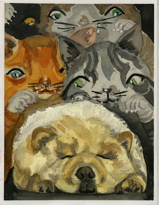
Revenge of the kittens..........


This is my assignment: Cute kitschy animals in action. In watercolor.
This was really hard for me to start and sketch out, as I am terrible at making things look cute... I had to spend a lot of time redrawing and trying to un-creepify it. But I kind of had fun with the watercolor after a while... I didn't hate it as much as I thought. It also doesn't hurt that I referenced possibly the cutest puppy in the universe.
I think it could use more contrast though now that I see it on the screen.

two people in a kitchen doing something


Bryant Molloy
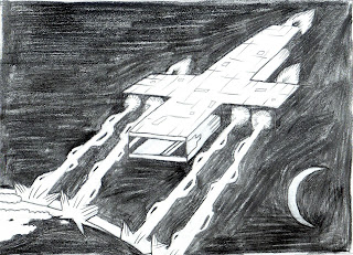
Charcoal.

landscape/collage


San Ahn
I honestly spend a lot of time on it, even though it doesn't look like it at all. I sketched first and made many copies of the sketch and planed what layer goes first, and cut the each layers of sketch, draw it on colored paper, cut the colored paper and glued it on. I lost so many detailes, I think I should've made the sketch more simple and clear. Hate the colors, hate the shapes, hated the process, I hate evey single element of it.

Political Illustration in Charcoal

The Dalai Lama and Obama met at the White House and China was pissed.
By Jessica.

I hate it I hate it. I had a really hard time sketching it. Charcoal is too stubby in my hand and I couldnt get  a fine point. I tried using the pencils but they didn't do that smudgy thing very well/ at all.

Imaginary Landscaped in oil


Lauren Straughn

I took a picture of a street in my neigborhood and went from there. Oil was definitely a challenge I felt like I just kept smearing everything.

Political Watercolor

Nicole Mueller
My assignment was to do a political piece using watercolor...I based it off of two Time articles titled "Why Washington Is Tied Up In Knots" and "Why Washington Can't Fix Itself"

Cristina Daura: Acrylic + political illustration


sorry I'm late. My internet is great.
political issue: spanish fascism repression in Catalunya

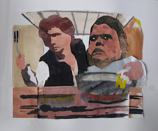
Justin Schmidt: Collage 2/26/10

"Han Solo and Meatloaf making breakfast together"

Girl and Pup Collage


by Brandon Wallace

I started out with some magazines pasted on cardboard, scanned them in, and did some digital drawing on top of them. I think im going to print it out, and continue by adding some painted paper.

2 boys/watercolor/environment


was not so bad! boys are silly!

Thursday, February 25, 2010


This is the base collage and I've got to go back in with pencil and some light glazes, and then I'm going to attach the characters in the kitchen

Tuesday, February 23, 2010

Fear Sketch


Hello everyone. I've been sick all last week and haven't been able to work much on the fear piece. I ended up starting completely over because I wasn't satisfied with the composition or the size of it.

Right now I'm looking more for suggestions on what to add to the sketch - I plan on adding some floor tiles, maybe a table, and counter tops. If you have anything else that you think would look good, please let me know. My final will be in ink (my fears are human form and ink). Also, if you could give me tips on anatomy that would be greatly appreciated. The narrative of this illustration is a mother who cooks the limbs of her child for dinner.

Also, I will update this post as I work on the image.

Friday, February 12, 2010

(FRIDAY) Feedback for your pieces...

Look for an email from me, with feedback on all of your pieces!
*Dana

Positive/Negative

by Cristina Daura

Black/White

By: Mollie

Positive/ Negative


By, Bryant Molloy.

I plan on making the "barf" more layered after seeing it on the computer..

Positive/Negative

by: Nicole
I was wondering if for the final I'd be able to do a linocut? Or if this would translate well to that?

Lauren Straughn


The one below is the one I like but I perfer the squirrel in the first image.


are things clear here? They were fine in the pencil sketch but I thought it would be better to use a flat black so i hit it up with a photoshop brush. Maybe more details in the rats?

I would ultimately like to do a lino cut of this for the assignment

Positive/Negative

by: Brandon Wallace

*I added shadows and clouds to my piece, please ignore the hatching, that only happened because i was using hard pencil led.

Positive/Negative Image

By: Justin Schmidt

You can see a faint pencil line marking the edge of the image. i haven't filled the "negative space" in with black because i was afraid it'd over power it, however necessary it may end up being in the final product.

suggestions about adding the black to the large blank space?

or any other suggestions? maybe about the figure in the doorway?

Thursday, February 11, 2010

+ -


Jessica Dikdan.

EDIT* Wow i completely forgot two essential parts in my sketch (the bubble and the vomit) so I did a quick fix. thank you Justin for reminding me. Sorry bout that!

Tuesday, February 9, 2010

Greg Bowen Pos/Neg space (that's not what I expected)


Here it is


I got the assignment mixed up and inked it already, but i can still go back and change things. The idea is that its a girl who uses make up to cover up the fact that she's not even human. Also, should I do any more revisions on the cat?


By: Matthew Carignan
Positive/ negative

Any suggestion would be helpful. Im not really happy with it so far
By: Nicole Ackerman
Title: positive negative
hmm im not sure how i feel about this, suggestions?

Positive/Negative/Positive/Negative


by jee-shaun wang

Positive/ Negative


by : A. Shin

Positive/Negative


by Claire Kim

Ottoman Turkey: Positive / Negative

by: Sarah Slowinski

By Deming Harriman, Name: Positive Negative fat man in kiddy tub


Added note: I didn't fully black out the background. But it would be all black, since this was a sketch I just did the crosshatch to tell where it would be.

Positive/Negative


by: Holly Rothrock

I wasn't sure whether to go with flat shapes or shapes made by light.

I also went over my old ink drawing with a pen and nib.
All the filled in bits are black of course. There's no gradient, just black and white

positive/negative


by: Chelsea Soisson

Positive/Negative

Positive/Negative

Sean FitzPatrick
I outlined all the white shapes in my sketch and colored it in photoshop to get a solid black.
I'm also going to straighten out the board and the wall in the final.

Well THAT'S not what I expected! (Part 4)


By: Allison Fritsch

Black and white shenanigans

Positive/Negative


hello?

Sunday, February 7, 2010