 Heres my final sketch for the mason project since i wasn't in class yesterday. Any suggestions would be greatly appreciated
Wednesday, December 2, 2009
Monday, November 30, 2009
MASON AD SKETCH
Wednesday, November 18, 2009
Band poster re-do
Tuesday, October 13, 2009
Clem Snide - Rough Sketch

My current idea is to have a bunch of different sized books floating in the air, with string that has been tied through their centers, that hangs down and is tied to an object that reflects the concept of the individual book.
Each book will have some sort of cover design that alludes to its purpose. There will be two books out of the bunch whose covers will attract special attention, using color combination or other means. These two books will be "Clem Snide" and "World Tour."
This piece will be more concerned with correct anatomical structure compared to the triptych project.
Mitchell Goodrich
THE NEW PORNOGRAPHERS
Alright. Here's my Band.
They're called the new pornographers. I've downloaded like 75% of their discography and have discovered they're an upbeat, sort of poppy indie band that has a slight electronic feel (however their latest album supposedly loses that, i still need to acquire that though.)
Since they deal with a lot of iconic imagery I wanted to incorporate that sort of feel and use this classic image of the earth from the moon for the world tour

And make it sort of like their first album by having something a little bit 'sexy'
I wanted it to look a little sleazy and weird, but so far it just looks my regular style only the figures happen to be sexual. I also don't know if I pushed this too far or not, i think it's pushin' it. Lastly I want to throw in a 'twin cinema' reference and add a video camera on a tripod in the background but I think that might be reaaaally too much. And yes it's crappily drawn right not but the image above is supposed to be the background of my sketch.

Also the final will not be pink or stylized this annoyingly. It will probably be flat color and limited palette much like their recent album. And I have NO IDEA what to do for the type. At all.
They're called the new pornographers. I've downloaded like 75% of their discography and have discovered they're an upbeat, sort of poppy indie band that has a slight electronic feel (however their latest album supposedly loses that, i still need to acquire that though.)
Since they deal with a lot of iconic imagery I wanted to incorporate that sort of feel and use this classic image of the earth from the moon for the world tour
And make it sort of like their first album by having something a little bit 'sexy'
I wanted it to look a little sleazy and weird, but so far it just looks my regular style only the figures happen to be sexual. I also don't know if I pushed this too far or not, i think it's pushin' it. Lastly I want to throw in a 'twin cinema' reference and add a video camera on a tripod in the background but I think that might be reaaaally too much. And yes it's crappily drawn right not but the image above is supposed to be the background of my sketch.

Also the final will not be pink or stylized this annoyingly. It will probably be flat color and limited palette much like their recent album. And I have NO IDEA what to do for the type. At all.
Poster Rough Sketch- The Zutons

Im doing a linoleum print of this so the sketch is pretty simple compared to what I want the final outcome to be. There will be a lot more detail in the finished product than here but this is the basic look of it. The band is The Zutons, they are always displayed as robots or something to do with robots so I thought I'd stick to that theme. It's supposed to be them in a giant robot thing taking over the world. I think I'm actually going to take out the ice, the eiffel tower and the city. The land masses are going to be very 3 dimensional, really sitting ontop of the water. I'm just using black ink for the print then I'm filling in a lot of the space with watercolor. That's where I hope to get a lot of movement in all the currently empty space. I'd really appriciate some feed back as I would like to go ahead and move forward with the printing process. Thanks :)
band poster

I thought the final sketch of this was due, so this is actually pretty much done. I used Alabama's actual logo, but added all the filigree around it, and the stars. The colors of this are going to be fairly flat, and I am going to use this sketch for the base of my overpainting, which will be in goache. there's gonna be a lot of red, white and blue. this is one damn american band.
Cat Power
This is a fairly simplistic piece, because the singer is of the minimalist genre, according to Wikipedia. I used the font that is seen on one of her other albums, which I will post below my image. I'm not really sure what else I should do with this. I was thinking a comic-book style "pow" shape, with the spikes and everything. I'm also considering trying gauche out on this, since I want the color to be flatter. I believe I can take this further, but I need feedback on how to do it.


band poster

Ok so my band is IL DIVO. they're an international pop group, whose producer is simon cowell of all people. They sing in french, italian, english, and i think german too. Well they give off an italian vibe, epecially their name so this hopefully should look like an aerial view of a canal in venice. Im thinking i'll add more details, like draw out some bricks in the buildings, and just add more props overall
nicole ackerman trip
Matthew Carignan trip


The tryptic is the story of Isobel, a song by Bjork. The first piece is Isobel being born from a flame in the middle of a forest and her seeing that the pebbles beneath her feet are tiny skyscrapers. The middle is when she is an adult and the skyscrapers and humans have taken over the whole forest. She sends out trained moths to sing in humans ears while they sleep to remind then to stop thinking with their heads and start thinking with their hearts. The end image, which won't upload for some reason, is a large tree shaped like a human figure growing over top of the buildings, which is supposed to represent her influence on the humans without ever really fitting in with them.
I have a lot of concerns with this and feedback would be greatly appreciated.
triptych
Steven johnson trip


 Here is some chorus to help you visualize the song by lynyrd skynyrd call needle and a spoon
(chorus)
It was the needle and the spoon
And a trip to the moon
Took me away, took me away
(chorus)
Quit the needle. Quit the spoon
Quit the trip to the moon
We gonna take you away. Lord, we gonna take you away
(chorus)
Don't mess with the needle or a spoon
Or any trip to the moon
It'll take you away
Im sure color will aid in the trippyness of it all. planning on using water color and color pencil or just water color and ink
tryptich
Here is my Beginning, Middle, and End. My story was an old folktale about a snake prince.
In the "Beginning," an old widow goes to a fig tree to gather figs, and ends up making a deal with the snake that lives in it to give him her daughter's hand in marriage.
In the "Middle," the snake is revealed as the Snake Prince when the daughter dreams of a man crawling into her bed at night. The widow spies on her daughter in her sleep, sees the snake shed his skin, take human form, and climb into bed with her daughter. She then burns his skin, keeping him as the snake prince.
At the "End," the widow's OTHER daughter is swallowed by the snake husband she found (who, obviously, is not a prince) and the snake prince saves her by gutting the other snake. However, when snake blood touches him, he begins to transform back into a snake.

Emma Maatman
Epic Battles and Such
Hello all. This is my triptych. It has been crazy frustrating so far.
My approach towards this project was to try and do something different by doing some dramatic, fantastical type imagery.
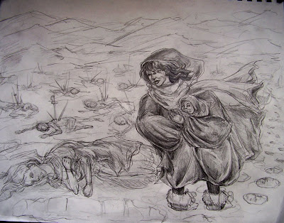
The basic story here is that this particular land has been midst a civil war and the remains of it are slowly being frozen and lost in this wintery realm. Due to the extreme climate and fighting, the population has decreased massively, people are banded together in small, broken groups except for the hunters, due to their survival skills. One such hunter gets lost from the group and falls into the snow to find a young child still alive in the frozen dead arms of it's mother. She takes the child with her and eventually her and her clan grow in number and find an abandoned blade laying in the grass. This blade ends up leading them to an abandoned castle where they begin to settle and the blade becomes a symbol of the newly formed colony.
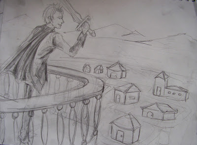
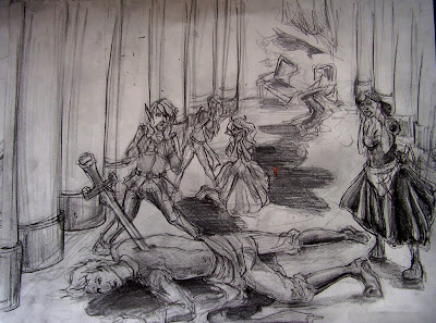
The colony grows and collects scattered members of other races and former classes and eventually decides they need a figurehead for their new land. Being the 'son' of the original group of hunters, the surviving child, now an adult rises to power. Because he was taught to treat the land and the animals he grew up hunting with respect he carries that through in his reign. However, he is much too trusting and a few individuals, descendants of the original inhabitants of the castle begin to plot against him. They eventually strike him in the back with the symbolic blade of the colony and he falls to the ground, however, this time he is no longer a survivor.
I wrote this out in a more descriptive, drawn out way but it kind of bothers me. If anyone wants to read it ask I guess but this is pretty much idea.
So, on to the images. The first one attempts to potray the 'rescuing' of the child. (though like an hour ago I got the grand idea that maybe i should make the first image the discovery of the castle, wish i had thought of that earlier) the second image is him looking upon his kingdom. I was originally going to do a crowd but I had no idea how to pull that off without it looking terrible so any suggestions there would be great. And the third image is the one i'm hating the least right now, the dramatic death of the ruler.
I'm planning on doing these in acrylic on an 14x17 scale. I'm unsure if the peices are enticing and 'epic' enough. The only composition i'm truely happy with is the last one. The other two, especially the middle i feel get kind of boring, and i'm unsure if the 'fantasy' feel is really coming off.
Please, go all out on crit, I need it!!
My approach towards this project was to try and do something different by doing some dramatic, fantastical type imagery.
The basic story here is that this particular land has been midst a civil war and the remains of it are slowly being frozen and lost in this wintery realm. Due to the extreme climate and fighting, the population has decreased massively, people are banded together in small, broken groups except for the hunters, due to their survival skills. One such hunter gets lost from the group and falls into the snow to find a young child still alive in the frozen dead arms of it's mother. She takes the child with her and eventually her and her clan grow in number and find an abandoned blade laying in the grass. This blade ends up leading them to an abandoned castle where they begin to settle and the blade becomes a symbol of the newly formed colony.
The colony grows and collects scattered members of other races and former classes and eventually decides they need a figurehead for their new land. Being the 'son' of the original group of hunters, the surviving child, now an adult rises to power. Because he was taught to treat the land and the animals he grew up hunting with respect he carries that through in his reign. However, he is much too trusting and a few individuals, descendants of the original inhabitants of the castle begin to plot against him. They eventually strike him in the back with the symbolic blade of the colony and he falls to the ground, however, this time he is no longer a survivor.
I wrote this out in a more descriptive, drawn out way but it kind of bothers me. If anyone wants to read it ask I guess but this is pretty much idea.
So, on to the images. The first one attempts to potray the 'rescuing' of the child. (though like an hour ago I got the grand idea that maybe i should make the first image the discovery of the castle, wish i had thought of that earlier) the second image is him looking upon his kingdom. I was originally going to do a crowd but I had no idea how to pull that off without it looking terrible so any suggestions there would be great. And the third image is the one i'm hating the least right now, the dramatic death of the ruler.


I'm planning on doing these in acrylic on an 14x17 scale. I'm unsure if the peices are enticing and 'epic' enough. The only composition i'm truely happy with is the last one. The other two, especially the middle i feel get kind of boring, and i'm unsure if the 'fantasy' feel is really coming off.
Please, go all out on crit, I need it!!
Subscribe to:
Comments (Atom)


.jpg) im not happy with this but im sure il keep you guys updated
im not happy with this but im sure il keep you guys updated


